knitr::opts_chunk$set(message = FALSE, warning = FALSE)Simple Linear Regression
Welcome
In the previous lab we learned about correlation. We visualised the relationship of different types of variables. We also computed one correlation measure for two numeric variables, Pearson’s correlation. We used Pearson’s correlation to summarise the strength and direction of a linear association between two numeric variables. However, it presents some limitations. It can only be used for numeric variables, it allows only one pair of variables at a time, and it is only appropriate to describe a linear relationship.
Linear regression can overcome some of these limitations and it can be extended to achieve further purposes, such as using multiple variables or to make predictions for new scenarios. This technique is in fact common and one of the most popular in quantitative research in social sciences. Therefore, getting familiar with it will be important for you not only to perform your own analyses, but also to interpret and critically read the academic literature.
Linear regression is appropriate only when the dependent variable is numeric (interval/ratio).
However, independent variables can be categorical, ordinal, or numeric. You can include more than one independent variable to evaluate how these relate to the dependent variable. In this lab we will start using only one explanatory variable. This is known as simple linear regression.
TipDon’t Panic
We will be covering linear regression over three weeks. Do not worry if everything this week doesn’t immediately make sense. We will revisit and build upon key ideas over labs 9 and 10 as well.
Please also do let me (Alasdair) know where anything is unclear or is confusing. We have been updating the lab content this year based on student feedback from previous years and value any feedback on the newest version so we can continue to make improvements.
As they cover some key concepts relevant for the summative assignment, I will aim to make further updates this year to Labs 8 - 10 based on any initial feedback.
Setup
R Markdown
For this lab, we will continue using the 2012 NILT survey to introduce linear models.
As usual, we will need to setup an R Markdown file for today’s lab. Remember if you are unsure about any of the steps below you can take a look back at Lab 6 which has more detailed explanation of each of the steps.
To set up a new R Markdown file for this lab, please use the following steps:
- Please go to your ‘Lab Group ##’ in Posit Cloud (log in if necessary);
- Open your own copy of the ‘NILT’ project from the ‘Lab Group ##’;
- Within the Files tab (bottom-right pane) click ‘New File’, then ‘R Markdown’ from the drop-down list of options;
- Within the ‘Create a New File in Current Directory’ dialogue, name it ‘Lab-8-Simple-Linear-Regression.Rmd’ and click OK.
- Feel free to make any adjustments to the YAML header.
- Create a new code chunk, with
```{r setup, include=FALSE}and in the chunk:
- Create another code chunk, named
preambleand again withinclude=FALSE. Then add the following in the chunk:
Please note, we are loading the haven package again this week as we will be coercing more variables.
- Run the
preamblecode chunk and if no errors, then everything is setup for this session.
Dataframe Setup
Let’s revisit the example from last week of the relationship between a respondent’s age and their spouse or partner’s age.
Firstly, let’s coerce the variables for the age of the respondent’s spouse/partner:
# Age of Respondent's Spouse / Partner
nilt$spage <- as.numeric(nilt$spage)
Bonus Activity: We are coercing a variable again each week as a reminder for how to do it. However, we could remove the need to coerce variables we are re-using across each R Markdown file. In Lab 3 we created the 01_prep_nilt_2012.R script in a sub-folder named R. Reviewing it, can you see where you could add a line of code to coerce spage? If so, modify your script, rerun it in full, then re-run the preamble code chunk in your R Markdown file for this week. After doing that, you’ll know you have successfully modified the script if you can run class(nilt$spage) in the Console and receive "numeric" as the output.
OK, we are going to use scatterplots to help visualise concepts related to linear regression. However, the NILT has hundreds of respondents, making very noisy plots. So, next let’s create a minimal sample of the dataset to only include 40 random observations:
Please note, we are creating a nilt_sample dataframe with a random selection of 40 observations - i.e. respondents - from the nilt data solely to help make it easier to visualise in the examples below.
To break down some of the code here:
- The
set.seed()function lets us set a seed to fix the random number generator. Results remain random, but using the same seed means when running code in the same order makes the results reproducible. - We then
filter(!is.na(spage)).!is the “NOT” operator, andis.na()checks whether a value is NA (i.e. missing data). So, combined it is equivalent to saying “filter to remove all observations where the value forspageis NA”. -
sample_n()is then used to randomly select 40 of the observations that remain.
Viewing Trends
Scatter Plots
Before we introduce linear regression itself, let’s start by visualising the relationship between the ages of the respondent and their spouse/partner.
We can do this with a scatter plot using the respondent’s spouse/partner age spage on the Y axis, and the respondent’s rage on the X axis. In ggplot, we compose the three key ggplot components - ggplot(aes()), geom_...(), and labs().
nilt_sample |> ggplot(aes(x = rage, y = spage)) +
  geom_point(position = "jitter") +
  labs(
    title = "Respondent's age vs respondent’s spouse/partner age",
    subtitle = "Random Sample of 40 Observations",
    x = "Respondent's age", y = "Respondent’s spouse/partner age"
  )
As you can see, even with this minimal example using 40 observations, there is a clear trend. If we were to guess - for the moment - it looks like the age of the spouse/partner might be generally the same as the respondent.
From the plot, it seems intuitive to draw a line that describes this general trend. Imagine a friend will draw this line for you. You will have to tell them some basic references on how to do it. You can, for example, specify a start point and an end point in the plot. Alternatively, which is what we will do below, you can specify a start point and a value that describes the slope of the line.
Thankfully, our friend is ggplot. We can pass it the two values we need - the start point and slope - in the geom_abline() function. This will then draw a line that describes these points.
nilt_sample |> ggplot(aes(x = rage, y = spage)) +
  geom_point() +
# Draw line assuming exact same age of respondent and their partner/spouse
  geom_abline(slope = 1, intercept = 0, colour = "red") +
  labs(
    title = "Respondent's age vs respondent’s spouse/partner age",
    subtitle = "Reference line assuming equal ages",
    x = "Respondent's age", y = "Respondent’s spouse/partner age"
  )
As noted in the comment in the code above, we are drawing this line at the moment as a ‘guesstimate’ a by-eye guess - that assumes the age of the spouse/partner is exactly the same as the respondent’s.
To draw a line like this, we used 0 as the starting value in the geom_abline() function. In statistics, this is known as the intercept and it is often represented with a Greek letter and a zero sub-index as \(\beta_0\) (beta-naught) or with \(\alpha\) (alpha). The location of the intercept can be found along the vertical axis (in this case it is not visible due to ages of respondents and their spouses/partners being 20+).
The second value we passed to describe the line is the slope, which uses the X axis as the reference. The slope value is multiplied by the value of the X axis. Therefore, a slope of 0 is completely horizontal. In this example, a slope of 1 produces a line at 45º. The slope is often represented with the Greek letter beta and a sequential numeric sub-index like this: \(\beta_1\) (b.
Was this a good guess?
Having drawn a line assuming respondents and their spouses/partners have the same age, how does that compare to our actual data?
First, let’s create a variable in our dataframe that matches our guess. We can do this by taking the starting point - the ‘intercept’ - and adding the steepness factor - the ‘slope’. We will store the results in a column called line1. After that, we can print the ‘head’ of our dataframe using the head() function to see the first few rows.
# A tibble: 6 × 3
   rage spage line1
  <dbl> <dbl> <dbl>
1    40    39    40
2    54    51    54
3    66    59    66
4    60    71    60
5    35    34    35
6    67    57    67
From the above, we can see that the respondent’s age rage and the column that we just created line1, are identical… which is not a surprise when our guess for now is that a respondent and their spouse/partner will be the same age.
But to return to our question, is the line we just drew good enough to represent the general trend in the relationship between the age of a respondent and their spouse/partner?
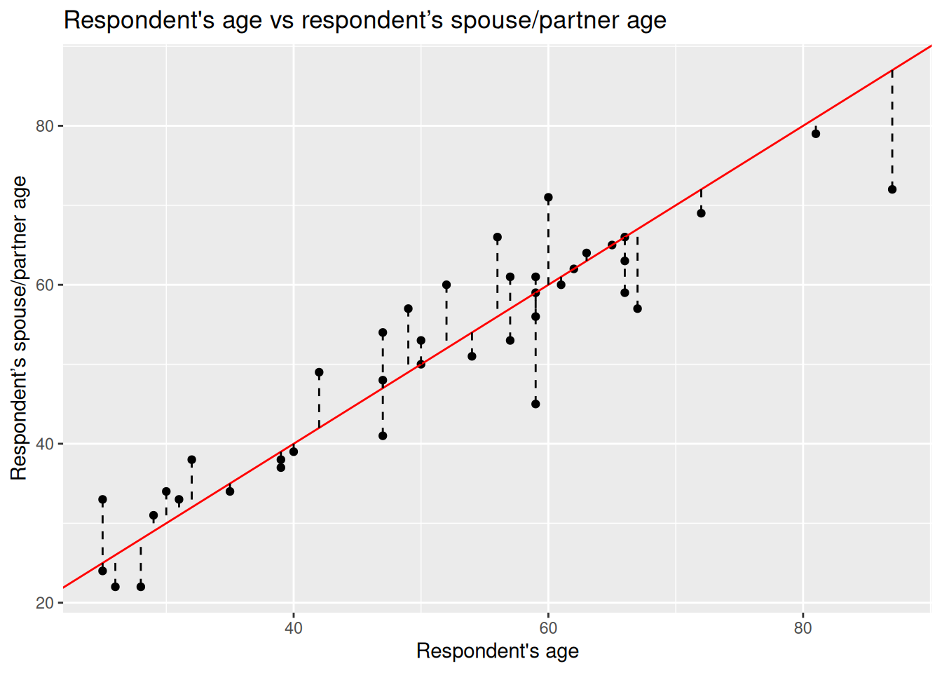
To answer this question, for each point of the plot we can measure the distance from it to where it would be on ‘line 1’ - which to repeat is a line drawn assuming participant’s and their spouse/partner are the same age.
We can use ggplot to draw this for us, using a dashed line to show the distance between each dot and our line 1.
nilt_sample |> ggplot(aes(x = rage, y = spage)) +
  geom_point() +
  geom_abline(slope = 1, intercept = 0, colour = "red") +
  geom_segment(aes(xend = rage, yend = line1), linetype = "dashed") +
  labs(
    title = "Respondent's age vs respondent’s spouse/partner age",
    subtitle = "Distances from each point to the guess line (residuals)",
    x = "Respondent's age", y = "Respondent’s spouse/partner age"
  )
Notice how this code is the same as our original scatterplot, we just added geom_segment(). For each dot, this function draws a line between it and the end points we give. By passing it xend = rage we are effectively telling it not to draw any horizontal line, and yend = line1 tells it to draw a line from the dot to where it would be if the spouse/partner’s age was the same as the respondents. We can then specify to used dashed lines with linetype = "dashed".
Residuals
This distance between the observation and the line is known as the residual or the error and it is often expressed with the Greek letter \(\epsilon\) (epsilon). Numerically, we can calculate this by computing the difference between the known value (the observed) and the guessed value.
Formally, the guessed number is called the expected value (also known as predicted/estimated value). Normally, the expected values in statistics are represented by putting a hat like this \(\hat{}\) on the letters.
Since the independent variable is usually located on the X axis and the dependent variable on the Y axis. We write write the expected (predicated) value with a hat on the Y like this: \(\hat{y}\) (y-hat).
Let’s estimate the residuals for each of the observations by subtracting \(\hat{y}_i\) from \(y_i\) (spage - line1) and store it in a column called residuals. Again we can use the head() function to see the first few lines of our dataframe.
# A tibble: 6 × 4
   rage spage line1 residuals
  <dbl> <dbl> <dbl>     <dbl>
1    40    39    40        -1
2    54    51    54        -3
3    66    59    66        -7
4    60    71    60        11
5    35    34    35        -1
6    67    57    67       -10
Coming back once again to the question, is my line good enough?
We could sum all these residuals as an overall measure to know how good our line is. From the previous plot, we see that some of the expected ages are higher than the actual values, whilst others are below. This produces negative and positive residuals. If we simply sum them, they would compensate each other and this would not tell us much about the overall magnitude of the difference.
To overcome this problem, we square each residual - multiply the residual by itself. This will make all of our values positive - “-3 x -3 = 9” - making it possible to sum them all together.
This is known as the sum of squared residuals (SSR) and we can use this as the criterion to measure how good our line is with respect to the overall trend of the points.
For line 1, we can easily calculate the SSR as follows:
# '^' is used for power - so `^2` squares our values
sum((nilt_sample$residuals)^2)
[1] 1325The sum of squared residuals for line 1 is 1,325.
Using a Linear Model
How does our line though compare to other potential lines we could have drawn to describe the trend? We can try different lines to find the combination of intercept and slope that produces the smallest error (SSR). How can we find the best line to describe the trend?
To our luck, we can find the best values using a well established technique called Ordinary Least Squares (OLS). Ordinary Least Squares chooses the line that minimises the Sum of Squared Residuals (SSR). We do not need to know the details for now. The important thing is that this procedure guarantees to find a line that produces the smallest possible error (SSR).
In R, it is very simple to fit a linear model and we do not need to go through each of the steps above manually nor to memorise all the steps.
To fit a linear model, simply use the function lm() and save the result in an object called m1 (for ‘model 1’) and print it.
m1 <- lm(spage ~ rage, data = nilt_sample)
m1
Call:
lm(formula = spage ~ rage, data = nilt_sample)

Coefficients:
(Intercept)         rage
      6.299        0.875
For simple linear regression, the lm() function takes arguments in form of lm(dependent-variable ~ independent-variable, dataframe), with the ~ (tilde) operator is used to separate the dependent variable and independent variable.
So, this is the optimal intercept \(\beta_0\) and slope \(\beta_1\) that minimises the Sum of Squared Residuals (SSR).
Let’s see what the SSR is compared to our original arbitrary guess:
Yes, this is better than before. Our line that assumed respondents and their spouse/partner had the same age had an SSR value of 1,325. So, this linear model is better as the SSR value is smaller.
To help visualise it, let’s plot the line we guessed and the optimal line together:
ggplot(nilt_sample, aes(x = rage, y = spage)) +
  geom_point() +
  geom_abline(slope = 1, intercept = 0, colour = "red") +
  geom_smooth(method = "lm", se = FALSE) +
  labs(
    title = "Respondent's age vs respondent’s spouse/partner age",
    subtitle = "Comparing a guess line (red) with the OLS best-fit line (blue)",
    x = "Respondent's age", y = "Respondent’s spouse/partner age"
  )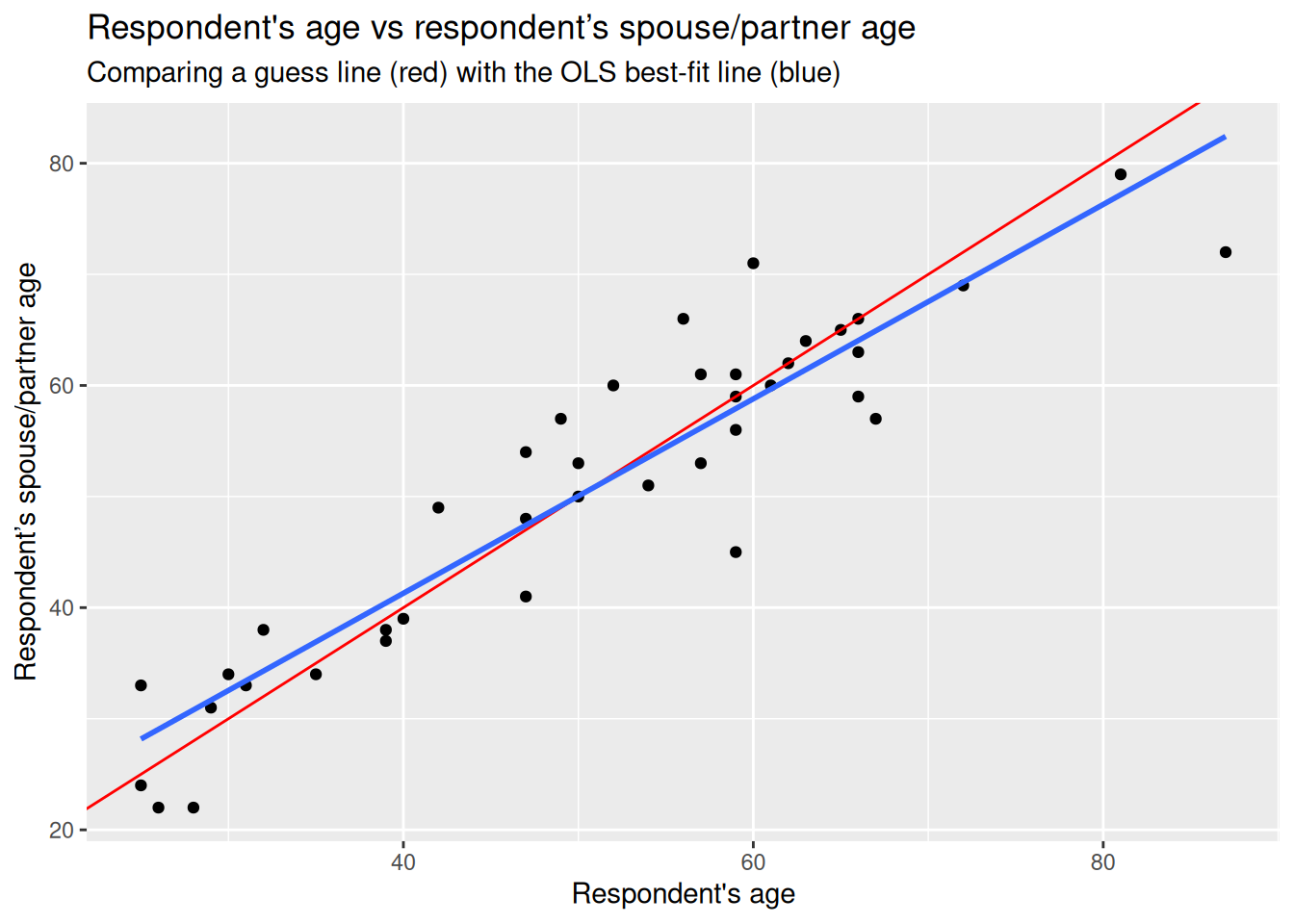
Again, notice how this is just the same code we used to draw our original guess, with an added line using geom_smooth() to draw a line using the linear model. We pass it two arguments, method = "lm", to specify that a linear model should be used to draw the line, and se = FALSE so it draws only the line. (By default, geom_smooth() has se = TRUE to include confidence bands so we need to explicitly use se = FALSE to turn them off.)
The blue is the optimal solution based on a linear model, whereas the red was just our initial arbitrary guess. We can see that the optimal is more balanced than the red in relation to the observed data points.
Formal specification
Now you are ready for the formal specification of the linear model.
After the introduction above, it is easy to take the pieces apart. In essence, the simple linear model is telling us that the dependent value \(y\) is defined by a line that intersects the vertical axis at \(\beta_0\), plus the multiplication of the slope \(\beta_1\) by the value of \(x_1\), plus some residual \(\epsilon\). The second part of the equation is just telling us that the residuals are normally distributed (that is when a histogram of the residuals follows a bell-shaped curve).
\[ y_i = \beta_0 + \beta_1 x_i + \varepsilon_i, \qquad \varepsilon_i \sim \mathcal{N}(0, \sigma^2) \]
You do not need to memorize this equation, but being familiar to this type of notation will help you to expand your skills in quantitative research.
Fitting linear regression in R
R syntax
We already fitted our first linear model using the lm() above, which of course stands for linear model, but let’s go back through it in relation to the specifications.
The first argument takes the dependent variable, then, we use tilde ~ to express that this is followed by the independent variable. Then, we specify the data set separated by a comma, as shown below:
Example Code - do not run
lm(dependent_variable ~ independent_variable, data)Running a simple linear regression
Now, let’s try with the full nilt data set.
First, we will fit a linear model using the same variables as the example above but including all the observations - remember that before we were working only with a small random sample of 40 observations.
The first argument is the respondent’s spouse/partner age spage, followed by the respondent’s age rage. Let’s assign the model to an object called m2 (for ‘model 2’) and print it after.
m2 <- lm(spage ~ rage, data = nilt)
m2
Call:
lm(formula = spage ~ rage, data = nilt)

Coefficients:
(Intercept)         rage
     3.7039       0.9287
The output first displays the formula employed to estimate the model - under Call:. Then, it shows us the estimated values for the intercept and the slope for the age of the respondent, these estimated values are called coefficients.
In this model, the coefficients differ from the ones in the example above (m1). This is because as we are now using the full nilt dataframe we have more information to fit the line. Despite the difference, we see that the relationship is still in the same direction (positive). In fact, the value of the slope \(\beta_1\) did not change much if you look at it carefully (0.87 vs 0.92).
Interpreting results
But what are the slope and intercept telling us? The first thing to note is that the slope is positive, which means that the relationship between the respondent age and their spouse/partner age are in the same direction. When the age of the respondent goes up, the age of their spouse/partner is expected to go up as well.
In our model, the intercept does not have a meaningful interpretation on its own. What we mean by saying it is not meaningful is that it would not be logical to say that when the respondent’s age is 0 their partner would be expected to be 3.70 years old. Instead, the interpretations should be made only within the range of the values used to fit the model (the youngest age in this data set is 18).
The slope can be interpreted as follows: For every year older the respondent is, the partner’s age is expected to change by 0.92. In other words, the respondents are expected to have a partner who is 0.92 times years older than themselves. Or, to put it in more simple terms, for each 1-year increase in the respondent’s age, the expected spouse/partner age increases by 0.92 years. On average then, partners are slightly younger than respondents.
In this case, the units of the dependent variable are the same as the independent (age vs age) which make it easy to interpret. In reality, there might be more factors that potentially affect how people select their partners, such as gender, education, race/ethnicity, etc. For now, we are keeping things ‘simple’ by using only these two variables.
Let’s practice with another example. What if we are interested in income?
We can use annual personal income persinc2 as the dependent variable and the number of hours worked a week rhourswk as the independent variable. We’ll assign the result to an object called m3 (for ‘model 3’).
m3 <- lm(persinc2 ~ rhourswk, data = nilt)
m3
Call:
lm(formula = persinc2 ~ rhourswk, data = nilt)

Coefficients:
(Intercept)     rhourswk
     5170.4        463.2
This time, the coefficients look quite different. The results are telling us that for every additional hour worked a week a respondent is expected to earn £463.2 more a year than other respondent.
Note that the input units are not the same in the interpretation. The dependent variable is in pounds earned a year and the independent is in hours worked a week. Does this mean that someone who works 0 hours a week is expected to earn £5170.4 a year (given the fitted model \(\hat{persinc2} = 5170.4 + 0*463.2\)) or that someone who works 110 hours a week (impossible!) is expected to earn £56K a year? We should only make reasonable interpretations of the coefficients within the range analysed.
Finally, an important thing to know when interpreting linear models using cross-sectional data (data collected in a single time point only) is: correlation does not imply causation. Variables are often correlated with other non-observed variables which may cause the effects observed on the independent variable in reality. This is why we cannot always be sure that X is causing the observed changes on Y.
Model evaluation
Model summary
So far, we have talked about the basics of the linear model. If we print a summary of the model, using the handy summary() function, we can obtain more information to evaluate it.
summary(m2)
Call:
lm(formula = spage ~ rage, data = nilt)

Residuals:
    Min      1Q  Median      3Q     Max
-33.211  -2.494   0.075   2.505  17.578

Coefficients:
            Estimate Std. Error t value Pr(>|t|)
(Intercept)  3.70389    0.66566   5.564    4e-08 ***
rage         0.92869    0.01283  72.386   <2e-16 ***
---
Signif. codes:  0 '***' 0.001 '**' 0.01 '*' 0.05 '.' 0.1 ' ' 1

Residual standard error: 4.898 on 589 degrees of freedom
  (613 observations deleted due to missingness)
Multiple R-squared:  0.8989,    Adjusted R-squared:  0.8988
F-statistic:  5240 on 1 and 589 DF,  p-value: < 2.2e-16
The summary output has several parts. This can look intimidating at first, but we can break it down bit-by-bit. Let’s focus on:
- first the call
- second the residuals
- third the coefficients
- fourth the goodness-of-fit measures
These are highlighted in the screenshot below:
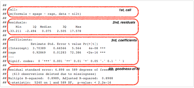
The first part, Call, is simply printing the variables that were used to produce the models.
The second part, the Residuals, provides a small summary of the residuals by quartile, including minimum and maximum residual values. Remember the second part of the formal specification of the model? Well, this is where we can see in practice the distribution of the residuals. The quartiles show typical prediction errors. For example, half of the residuals lie between the 1st and 3rd quartiles. So by looking at the values for the first and third quartile, we can see that half of the predicted values by the model are \(\pm\) 2.5 years old away from the observed partner’s age… not that bad.
The third part is about the coefficients. This time, the summary provides more information about the intercept and the slope than just the estimated coefficients as before. Usually, we focus on the independent variables in this section, rage in our case. The second column, standard error, tell us how large the error of the slope is, which is small for our variable. The third and fourth columns provide measures about the statistical significance of the relationship between the dependent and independent variable.
The most commonly reported is the p-value (the fourth column). R uses scientific notation for very small p-values. In our result the p-value is <2e-16, which means a number less than 0.0000000000000002, you can learn about scientific notation here).
As a general agreed principle, if the p-value is equal or less than 0.05 (\(p\) ≤ 0.05), we can reject the null hypothesis, and say that the relationship between the dependent variable and the independent is significant. In our case, the p-value is far lower than 0.05. So, we can say that the relationship between the respondent’s spouse/partner age and the respondent’s age is significant. In fact, R includes codes for each coefficient to help us to identify the significance. In our result, we got three stars/asterisks. This is because the value is less than 0.001. R assigns two stars if the p-value is less than 0.01, and one star if it is lower than 0.05. (P‑values, however, are just one part of the story; always read them alongside effect size, confidence intervals, and substantive meaning.)
In the fourth area, we have various goodness-of-fit measures. Overall, these measures tell us how well the model represents our data. For now, let’s focus on the adjusted R-squared.
R-squared is the proportion of variation in the outcome explained by the model. It ranges from 0 to 1: 0 means none of the variance is explained; 1 means all variance in the sample is explained by the model. Adjusted R-squared penalises adding variables that do not improve the model. In the social sciences, modest R-squared values are common.
Adjusted R-squared then can be understood as the proportion (multiply it by 100 to report a percentage) of variance explained by the model, adjusted for the number of independent variables used. In our age-age example, the model explains 89.88% percent of the total variance. This is a good fit, but this is because we are modelling a quite “obvious” relationship. The R-squared describes the model file, it does not judge the quality of our analysis.
You may wonder why we do not report the sum of squared residuals (SSR), as we covered in our initial example. This is because the scale of the SSR is in the units used to fit the model, which would make it difficult to compare our model with other models that use different units or different variables. Conversely, the adjusted R-squared is expressed in relative terms which makes it a more suitable measure to compare with other models. An important thing to note is that the output is telling us that this model excluded 613 observations which were missing in our dataset. This is because we do not have the age of the respondent’s partner in 613 of the rows. Missing spouse/partner ages can occur for serveral reasons. For example, the respondent may not have a parter, or choose not to answer.
In academic papers in the social sciences, usually the measures reported are the coefficients, p-values, the adjusted R-squared, and the size of the sample used to fit the model (number of observations).
Further checks
The linear model, as many other techniques in statistics, relies on assumptions. These refer to characteristics of the data that are taken for granted to generate the estimates. It is the task of the modeller/analyst to make sure the data used follows these assumptions. One simple yet important check is to examine the distribution of the residuals, which ought to follow a normal distribution.
Do the residuals follow a normal distribution in our model, m2? We can go further and plot a histogram to graphically evaluate it. Use the function residuals() to extract the residuals from our object m2, and then plot a histogram with the base R function hist().

Overall, it seems that the residuals follow the normal distribution reasonably well, with the exception of the negative value to the left of the plot. Very often when there is a strange distribution or different to the normal, it is because one of the assumptions is violated. If that is the case we cannot trust the coefficient estimates. In the next lab we will talk more about the assumptions of the linear model. For now, we will leave it here and get some practice.
Lab activities
In your R Markdown file, use the nilt dataset to:
- Plot a scatter plot using
ggplot. In the aesthetics, locaterhourswkin the X axis, andpersinc2in the Y axis. In thegeom_point()jitter the points by specifying theposition = 'jitter'. Also, include the best fit line using thegeom_smooth()function, and specify themethod = 'lm'inside. - Print the summary of
m3using thesummary()function. - Is the relationship of hours worked a week statistically significant?
- What is the adjusted R-squared? How would you interpret it?
- What is the sample size to fit the model?
- What is the expected income in pounds a year for a respondent who works 30 hours a week according to coefficients of this model?
- Plot a histogram of the residuals of
m3using theresiduals()function insidehist(). Do the residuals look normally distributed (as in a bell-shaped curve)? - Discuss your answers with your neighbour or tutor.